Plotting and scheming
Part 2 of The Proof, a series about typesetting’s history and the checks that proof this site.
On the web, a composed page can change as soon as someone reads it. A different screen or larger text changes where the words fall. I still want to know whether the relationships I chose for the type hold under those conditions.
For this site, I’ve built checks that open pages in a browser and inspect the rendered type and layout. They can examine the actual words, set in the actual face, at the size and line spacing the reader gets. A non-breaking space can change where a line breaks. A font substitution can change how much room the words need.
Those checks give me a way to revisit decisions as I work. But first I have to decide which relationships matter. I learned that by building a grid that made the type answer to its lines, and then I retired it.
The question is older than the browser: how much can a framework settle before someone has to judge the words within it?
Before a word was written
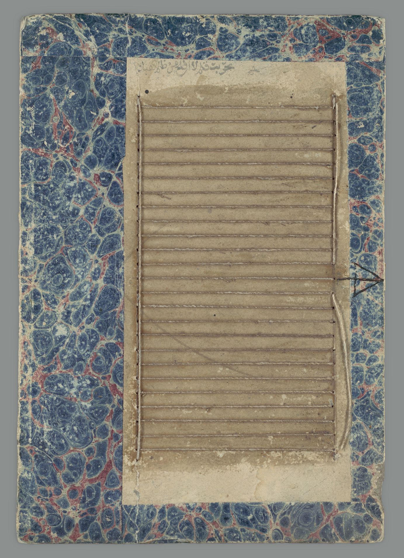
A manuscript’s first decisions were already visible on the unwritten page. The text block was measured out. Prick holes marked the ends of lines, and ruling supplied guides for the writing. The number of columns and lines gave the scribe a space to work within. (University of Nottingham.)
The ruling could survive where the words stopped. In a fifteenth-century Book of Hours, now held by the Free Library of Philadelphia as Lewis E 99, folio 129v, the Stabat mater ends near the top of a leaf. Red lines continue down the empty page. The frame was made before anyone filled it.
Look at the empty lines below the writing.
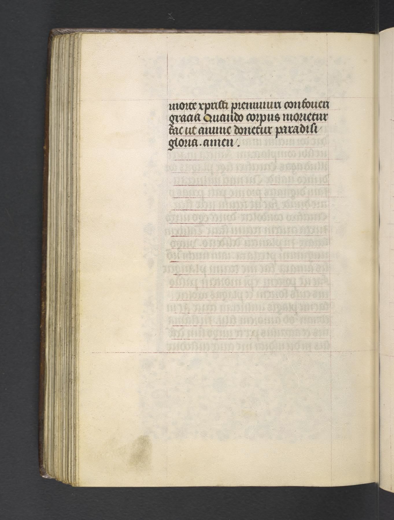
The scribe still had decisions to make inside it. In formal Gothic manuscripts, choosing an abbreviation or writing the word in full could bring the line to its ruled end. The letters and words were fitted as they were written. Albert Derolez describes this practice in The Palaeography of Gothic Manuscript Books, page 77. (Cambridge, 2003.)
A straight right edge was an ideal in some books, not a rule every scribe followed. Derolez notes that even luxury manuscripts could show little concern for it. The ruled edge was a condition of the work. It didn’t settle every choice within the line.
A mark for uncertainty
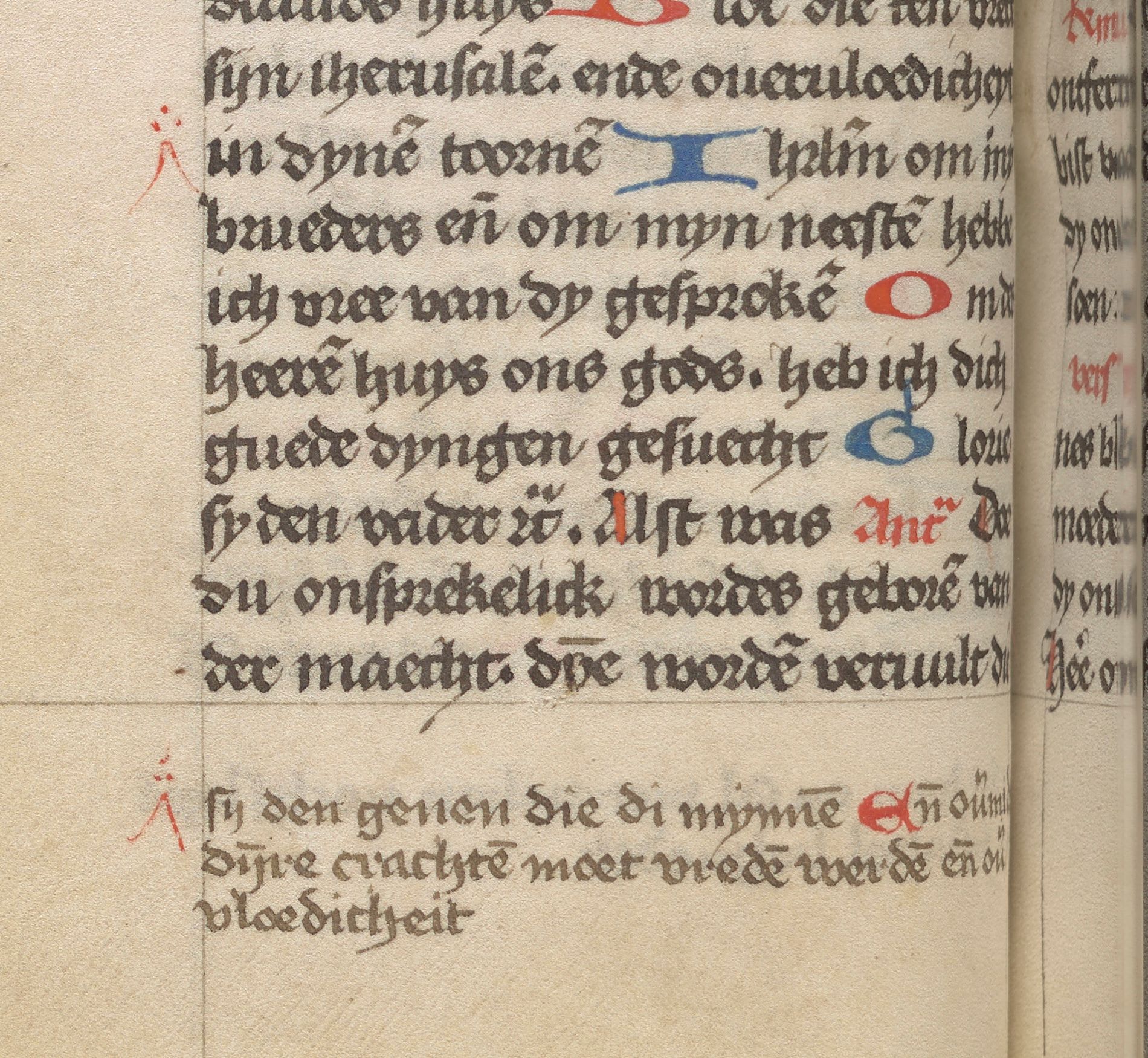
Correction followed the writing. A corrector could compare the text with a reference copy, known as an exemplar. They could erase a mistake or add an omission between lines or in the margin. Owners and later readers also corrected manuscripts. There wasn’t a separate trial copy. The correction changed the book itself. (Clemens and Graham, Introduction to Manuscript Studies, page 35.)
Follow the two red marks in Lewis E 91: one points into the text, and the other introduces the addition below it.
An insertion mark records a correction someone has made. Another kind of mark could record a question they couldn’t answer. In an eleventh-century correction of an older volume of Augustine’s letters, Ekkehard IV of St. Gall recorded that he had no other copy to consult. Where he couldn’t confidently correct it, he placed the letter R. W. M. Lindsay reads the mark as require: look it up. (Palaeographia Latina II, 1923, page 12.)
The mark kept an unresolved reading visible for the next person. A check should be just as clear about what it can’t settle.
The grid that became a blocker
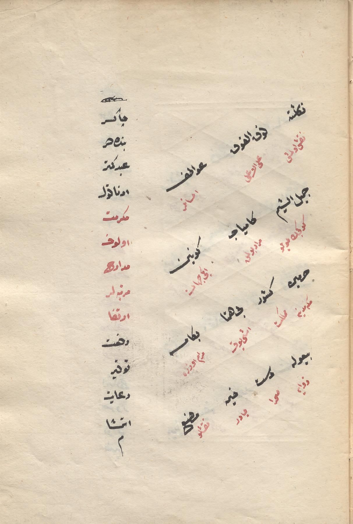
A ruled page needn’t be a stack of horizontal lines. In this Ottoman handbook for composing letters, the ruling supports slanting text alongside a vertical column. The framework follows the composition.
In my own grid, I gave alignment too much authority. I tried to hold this site’s typography to a baseline grid, using the distance between lines of body text as the unit for heading line heights, spacing, and the starts of blocks. In one early measurement, a drawn rule met the capitals within a hundredth of a pixel.
Six days later, a different measurement found a block on the about page starting 26px off the grid in a 400px-wide window with the page’s base font size enlarged to 32px. Those weren’t two readings of the same conditions. The careful alignment hadn’t established that the system would hold elsewhere.
The grid also made a heading’s line height change with the viewport: 1.07, 1.21, or 1.27 times its type size. The grid stayed regular by changing the heading’s leading, the distance from one line’s baseline to the next. A property I’d choose for the reading had become whatever the grid needed to stay aligned.
Baseline grid
Title role
My perspective changed once I could use the grid myself. It didn’t support the more complex layouts I wanted to build. Learning its limitations taught me to look at the problem another way. Being too dogmatic about baseline heights put my attention on alignment while the rhythm and reading width of the text became secondary.
I retired it. The decision is recorded in architectural decision record (ADR) 0009, “The type scale leads; the baseline grid retires.”
The size and leading would serve the reading. The layout would accommodate them.
That changed what I asked the checks to do. A block no longer had to start on a grid line. Its gap had to match the spacing declared for it. I could choose a different composition and still inspect whether the browser had rendered the relationship I intended.
Giving each element a role
Retiring the grid didn’t mean giving up shared rules. I needed rules tied to what each element was doing. A typographic role connects a recurring job, such as body text or a heading, to choices about size, leading, spacing and reading width. Those choices can hold while I change the composition.
As I designed and wrote these articles, captions, definitions, sources, and diagram labels made me look more closely at the relationships between the type and the columns. I had to decide which rules those elements could share and where they needed their own treatment.
The manuscript reproductions in this article serve as evidence; the diagrams let me demonstrate a relationship. Those are different jobs within the same page.
I gave diagrams and evidence different relationships to the prose, then let their captions share a common column. The image’s shape and the space available determined whether that caption sat beside it or below it.
On a wide page, a diagram continues from the prose’s left edge. An evidence image starts farther right. An upright image and a diagram can end at the same column, with their captions beside them. A landscape image takes more columns and puts its caption below. The roles share relationships without requiring every figure to have the same shape.
I can study a caption, step back to judge the page, then return to the writing. The checks tell me whether the relationships I chose still hold.
Keeping the reasoning
With large language models (LLMs), I can research a question, try a layout, and revise the writing in a short loop. The source or the rendered page gives me something to judge. The model’s agreement alone doesn’t settle the question.
That short feedback loop also makes the reasoning easier to lose. I need a record of why I made a decision, as well as a check of its result. Before making another decision, I look for one I’ve already made. If I’m changing my mind, I need to explain why and follow the consequences through the earlier decisions it affects. Examples of the rule in use, and examples it rules out, help me reconstruct the choice later.
Retiring the baseline grid meant changing what the rhythm check measured as well as changing the layout. If the check still demanded that every block start on a grid line, it would enforce the decision I’d just rejected. The record needs to make that consequence clear.
Room for the actual words
One relationship I still want to hold is the width of body text. That reading width is its measure. It should grow with the space available, then stop at the limit I’ve chosen for the type.
Without that limit, a reading line can grow too long.
Without the limit
On this site, check:measure tests that relationship. From scripts/check-measure.mjs at commit 4e218d7:
// The reading line is the smaller of the space available and --measure, at
// every width, on every reading surface.
The script opens built pages in a browser, reads resolved sizes, and inspects boxes and text runs for overflow. To estimate characters per line, it measures a lowercase alphabet in the element’s own font. That gives it a ruler suited to the face. It doesn’t count the actual characters on each line or judge the words.
That limit has to work under changing conditions. On a narrow page, the space available sets the limit. On a wider page, the chosen measure does. Enlarging the body text changes that measure, because its length follows the text size. The reader’s setting is one of the conditions the layout has to accommodate.
Widen the frame. Watch where the text stops while the frame keeps growing.
With the limit
We measured the words and the spaces between them. Then we read the page.
When someone enlarges the text, let it take more lines. Keep words and controls available as the layout reflows.
The same approach applies elsewhere: a check can count rendered headline lines or compare the gaps between blocks with their declared spacing. It can test a relationship without requiring the page to keep one final form.
That gives me more confidence to build a complex typographic system. If I can’t measure a relationship yet, I have something to learn about the browser, the font, or how the browser uses the font’s OpenType features. That understanding is worth the work.
Reading it myself
A line can fit and still break at an awkward place. I’d put “and” on the next line here, with “the spaces between them.” That break follows the grouping of the sentence.
Break after “and”
the spaces between them.
Break before “and”
and the spaces between them.
Knuth and Plass make a related distinction in their 1981 paper, page 1136. In “Programs E and F,” they discourage breaking between “and” and “F,” but allow “E and F” to begin a line together. Their example concerns a reference, not a blanket rule for conjunctions in prose.
The width check can’t make that judgment. It can confirm that the words have the room I intended and leave the break for me to read. The next part follows the words to the right edge.
I’d still want to read the final form with my own eyes, in my preferred browser on my preferred device. It’s how I judge the writing and enjoy a typographic decision.