thoughtbot · 2020–22
A platform around the care
Groups Recover Together supports anyone affected by opioid use disorder. Its care model treats members as human beings first, and I think that’s both courageous and thoughtful: we all deserve care, connection and understanding. Members combine group therapy, in person or virtual, with medication that relieves cravings and withdrawal, so they can set goals and rebuild their lives.
I worked on it through thoughtbot, which supplied most of the tech team. I facilitated design-sprint work, designed the staff experience, and built the shared design system. The work crossed a web portal for care teams and React Native apps for members on iOS and Android.
A fellow designer led the early member flows and set the visual language. I carried that language into the Tailwind system and designed the staff-facing side of the same features. We worked from the colors, typefaces, and marketing material Groups already had, developing the product conventions together. After she moved to another project, I continued the design and systems work.
This was my first React Native feature work and my first design system for mobile. I needed a shared language I could maintain across two runtimes, while respecting the differences between them. A decision about color, spacing, or type shouldn’t need to be rediscovered every time I moved between the web portal and the app.
The work itself was consolidation. A set of tools assembled quickly during the pandemic had to become one platform, for a service moving to fully remote care, integrating with the electronic health record the organization already ran on. Most of the early judgment was deciding which parts of that to build, which to buy, and which to leave exactly where they were.
A phone number isn’t a person
We were building during the pandemic, when groups couldn’t meet in person. The team had moved quickly to keep care available through messages, video calls, and ways to send test results from home. Our job was to bring those steps into a more coherent experience. Talking to members helped us understand how much they already had to manage outside the app.
Staff trained on the software while we built it, which kept the client’s team reachable for feedback. We also interviewed members during the first sprint. Those conversations required empathy, grace, and respect. We were asking people about technology while they were doing the work of recovery, and their circumstances had to shape what we asked of them.
One finding changed the login model. Some members didn’t have a device of their own; others shared a device and a phone number with a partner who was also receiving care. One number could belong to two members. Each needed a private account. That assumption needed to change before we could make the login flow work for them.
We designed around usernames, including a migration path off phone sign-in and a way to recover a forgotten username. Shared devices also meant privacy and account access needed attention beyond the first sign-in screen. The invitation flows accounted for numbers that couldn’t receive a message, with a way to retry rather than leaving someone at a dead end.
The important lesson for me was how far a research finding could travel. A detail about how people accessed a phone affected registration, existing accounts, recovery, and invitations. Improving the screen in front of us would have left the underlying assumption intact.
Treating a phone number as an identity is a mobile default. For this population it couldn’t be one, so identity moved onto a name somebody claims, and the five capabilities on the right are what that single move required.
Where the platform stops
Staff research helped us draw another boundary.
We covered the part the care team needed day to day, kept the record itself authoritative, and named the edge where the two met. Somebody adding a member still finished the job in the medical record.
We didn’t need to reproduce every feature of the record system to make the care team’s work easier. We needed the relevant information to agree, a useful view of it for daily work, and a clear handoff for tasks still completed there. Research with staff helped us decide where that boundary belonged.
That was as much a product decision as an integration decision. A larger interface would have given us more to build and maintain without necessarily helping staff do their jobs. Naming the boundary made the scope easier to explain to the people using the platform and the people building it.
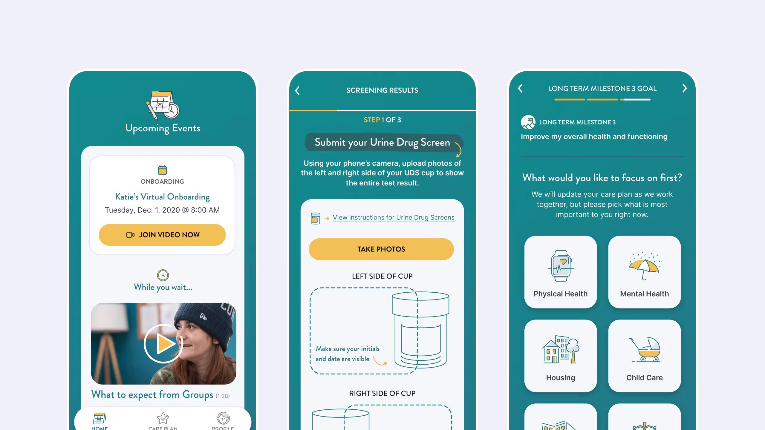
The sprint set the shape: essential features defined, the integration mapped, then a pilot with real members whose feedback drove the iterations. Interviews sorted what was essential to recovery from what merely stood in the way, and settled the three the product would be organized around: progress tracking, community, and needs and interventions.
One system, two runtimes
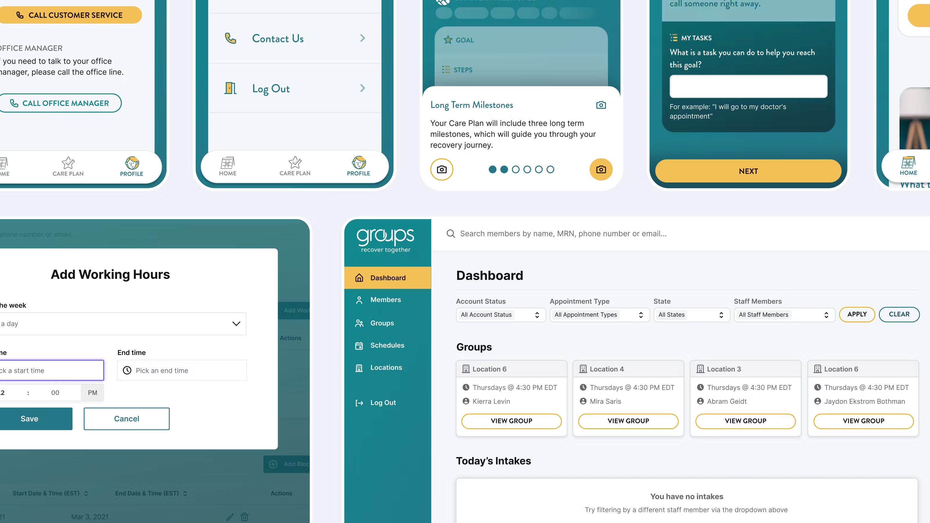
A single Pattern Library ran across the clinician’s console and the member’s phone. One shared Tailwind configuration ran across web and React Native, so a color or spacing step carried the same name in both places, with an abstraction layer for things that don’t map between them.
Those differences aren’t cosmetic. HTML permits text directly inside an ordinary container; React Native requires text to be rendered inside a Text component. We shared the design language while accounting for the platforms’ different primitives. Consistency didn’t require pretending the implementations were identical.
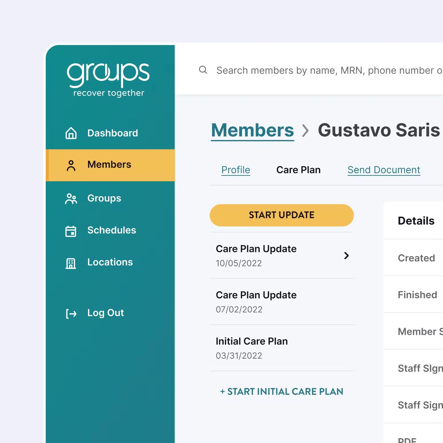
Care Plans were specified as Member and Admin pairs. A member needed to understand the next step; a care-team member needed to work with the same plan and its history. Looking at both sides together helped us decide what should stay consistent and what each person needed to see differently.
Outcome
The platform launched in beta in October 2021 as web, iOS, and Android apps. In January 2022 we handed it over to an in-house team, and by that June it had reached every member. The handover meant the design system had to be usable by people who had never met us: the real test of whether the naming and pairs were doing their job, and why we had been strict about both.
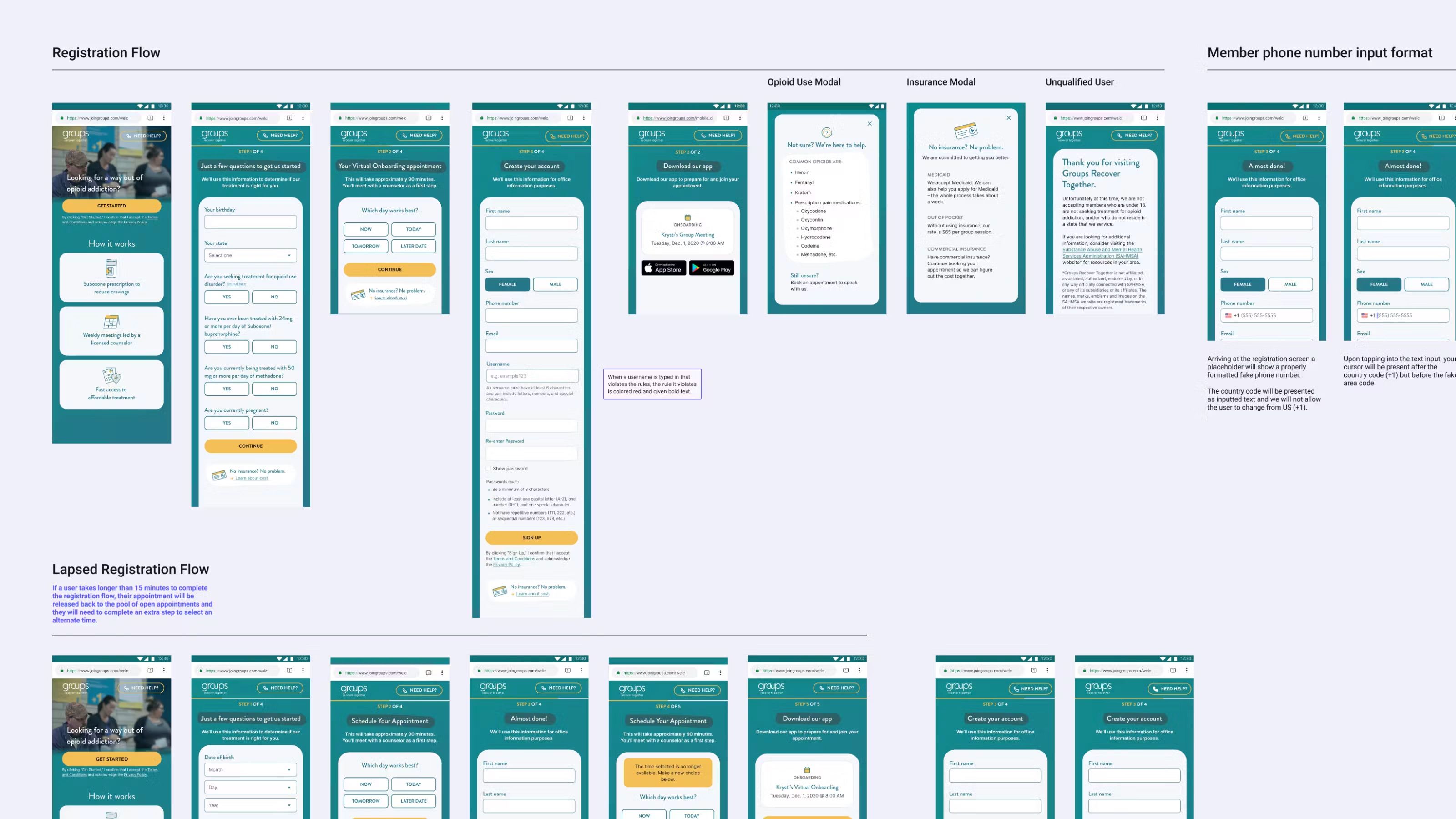
Self-scheduling, outreach, forms, payment, treatment planning, and group therapy all moved onto one platform, integrated with the electronic health record Groups already used. The same system carried a web portal for care teams and both mobile apps.
In its June 2022 announcement, Groups reported that membership had more than doubled since the start of the pandemic, and that thirty percent of members lived in counties without a physical office. The platform supported that expansion alongside the work of the care teams and the wider organization. Those figures describe the reach of the service, not a clinical result or an outcome I can attribute to the interface.
The outcome I’m proudest of is that we shipped mobile software shaped directly by the people who used it, and built to help them. The aim was to help members rebuild their lives with positive habits and a community of peers who could help them through difficult times. That mission stuck with me, and I still think about it. Working in health technology is a privileged position to be in, and I don’t think I’ll forget how important that felt.
What I’d change
We did a lot of research, and it was episodic: it arrived at milestones, in campaigns, when a phase called for it. I’d run standing interviews every two weeks with a fixed group instead, so that insight arrives continuously rather than being commissioned.
I’d also tell the next person to keep investing in the design system and let it evolve with the product. When a new feature comes along, step back and look at how the pieces work together. That keeps the visual language cohesive, and it shows the next person how much today’s foundations and components can already build.
And there’s a question I never had access to, which I’ve come to think is the real one. An organization like this sits between government grants, regulation, and its own financing, and the design problem underneath it all is how you ethically scale something like this: how to grow enough to support as many people as need help, without exploiting a single one of them.
I’d want those conversations to inform the next version of the product as much as the member and staff interviews informed this one. Understanding the immediate task mattered; understanding the conditions that made care possible would have made my decisions better too.