thoughtbot · 2022–24
Care before the first call
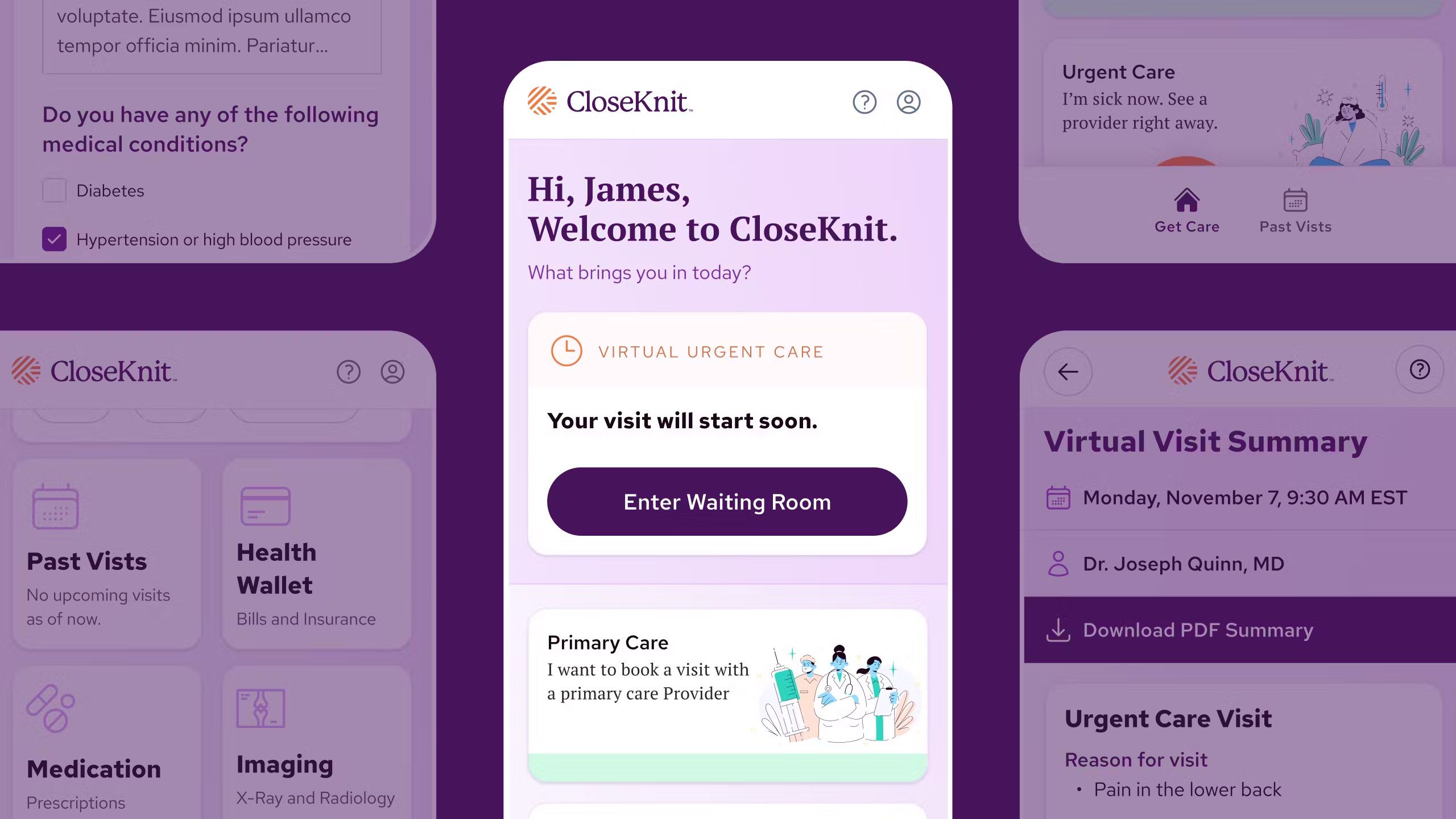
CloseKnit launched as CareFirst’s virtual-first advanced primary care practice. I worked on its urgent-care web experience through thoughtbot, designing and building the intake that connected a patient to a consultation. People could schedule from a phone or computer, within a service designed around CareFirst’s network and coverage.
Nearly forty percent of CareFirst’s members had no primary care doctor, according to its launch announcement. The intake needed to help someone begin a care relationship while asking for personal information, insurance details, and decisions about a visit. The form wasn’t the destination. It had to help someone reach a consultation.
The mobile apps already existed. The web build gave us a chance to develop the visual language around a logo and a set of colors, while keeping it recognizable beside the mobile apps. I worked with CloseKnit’s UX developer on a foundation that could support the intake we were shipping and the changes still ahead of us.
What we couldn’t change
Patient privacy and the connection to the medical record shaped what we could propose and test. The experience had to work for a new patient signing up and for someone already receiving care. Those constraints belonged in the design work from the start.
The clinical questions weren’t ours to write. They belonged to an external clinician network and couldn’t be altered. The consent, eligibility, and payment gates around them were fixed by law and by contract.
Almost none of the flow’s length was mine to delete. I had to understand which requirements were fixed before deciding where we had room to improve the experience. Sequence, grouping, progress, and the way a question was presented were still design decisions.
People also wanted the option of a bigger screen for a consultation. The web product answered a practical need: being able to see a provider on a desktop rather than having to use a phone.
Put the decision before sign-up
Order was one of the most useful things we could change. Before asking someone to create an account, we could show them who they might see and when a visit was available.
In the proposed flow, sign-up moved behind the providers and the time slot. Faces and names came before the request for personal details. Eligibility became an early question followed by a fuller confirmation later. The required steps stayed. The person completing them had more context for why they were there.
I don’t have funnel data that tells me how much this changed completion. What I can show is the decision: let someone understand the service before asking them to commit to it.
No gate is removed. Only the order changes: a face before a form, the hardest gate demoted to a confirmation of something already given, and the dashboard moved to the end, where it becomes the receipt. Drawn as a proposal, not an outcome.
Conditions are components
I built the design system in Tailwind around the part of the product we needed most: data capture. Form fields, labels, validation, and progress needed to work together across a long intake. I treated label placement as a choice with supported patterns, rather than something each screen would settle again.
The progress bar is a small example. I made it a component with compact and larger sizes, supporting both segmented steps and continuous progress. That gave us one place to maintain those variants as the flow changed.
I built an extended palette with contrast in mind and developed the typography alongside the form controls. Legibility and accessibility were part of the foundation the screens were built from.
A practice, not an insurer
The identity was drawn deliberately apart from its parent. A humanist serif runs across all six heading levels, with a full serif scale in the body, set against a neutral sans for the working text. That’s an unusual amount of serif for a health product, and the point of it was tone.
We wanted the experience to feel like a practice someone could turn to for care, while retaining the credibility of the organization behind it. The typography and illustrations gave us room to find that tone.
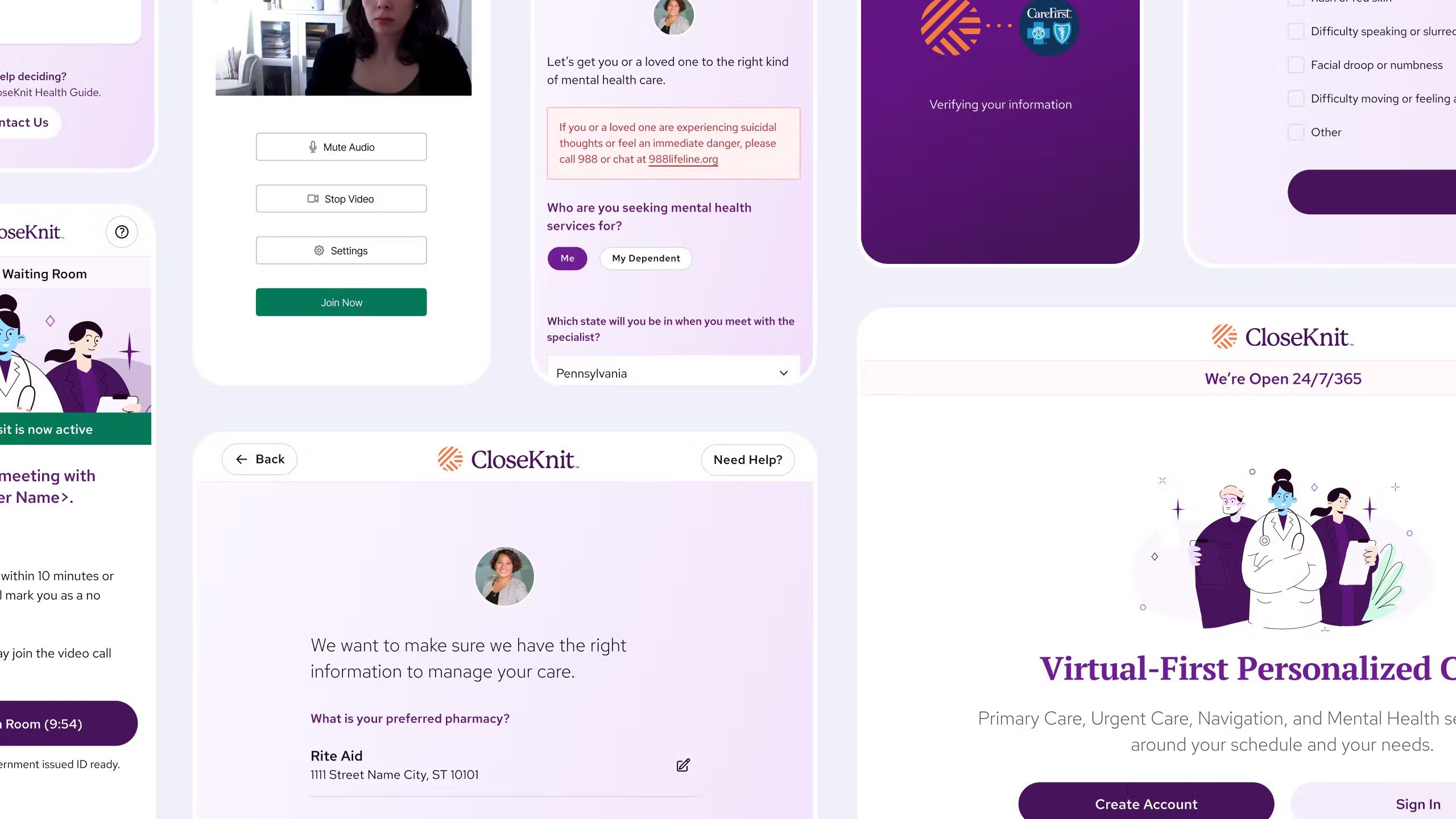
CloseKnit gave us room to experiment and trusted our design and technical judgment. Prototypes made that collaboration concrete: the team could use a proposed flow, question its order, and work through what it would take to build it. I could carry a decision from Figma into the front-end implementation instead of leaving its feasibility to a later handoff.
The web product also gave the native teams somewhere to see the evolving visual language in use. That influence was informal. We weren’t handing them a shared component library or claiming that the design system had been adopted unchanged.
A web product the team could grow
The web product extended CloseKnit past its mobile-only launch: members could see providers on a desktop and work with more than one of them. thoughtbot’s account of the engagement describes how Hotwire let the native teams inherit features with little new code. That’s a claim about the engineering approach, separate from the informal sharing of design decisions.
CloseKnit’s own product manager has said publicly that release speed improved eight to ten times over the first year.
In September 2026, the public booking flow showed providers before asking for an email address. I see continuity with the pattern we proposed, while recognizing the work of the teams who developed it afterward. The change also accompanied a business decision to acquire an in-person practice, which gave that part of the offer something real to point at.
The part I’m proudest of is a launch. In January 2023 we shipped Virtual Connect, CareFirst’s $0 virtual-care benefit delivered through CloseKnit, as an experiment in a new kind of offering, and the offering held. CloseKnit has since added in-person clinics alongside the app.
The identity eventually aged, and I designed its replacement. That’s the argument for keeping the brand layer separable from the product in the first place: you should be able to replace one without rebuilding the other.
This project let me establish conventions while the product was being built. The useful foundation was the one we could keep changing: clear form patterns, a brand layer we could replace, and a working relationship where design and engineering decisions could be made together.